Work / pedul · 2025–2026
pedulA brand for hiring that travels person to person.
- Client
- pedul
- Role
- Brand identity partner
- Services
- Brand identity, messaging platform, motion system
(Overview)
pedul is distribution for talent acquisition. It helps employers reach candidates through the creators they already trust, so a job opening is passed from person to person across social platforms.
pedul came to us for help with its seed-stage fundraising. Its positioning had moved on, but its brand and website hadn’t caught up. Hiring hasn’t changed, but where people find work has: careers are now discovered in a feed, not searched for on a job board.
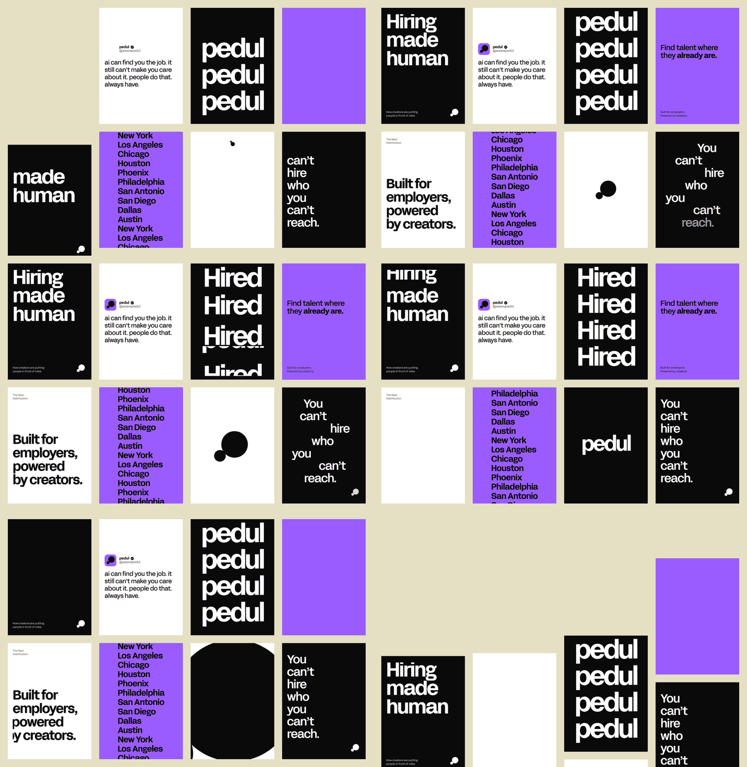
We built a brand that feels native to social, carries real weight with employers and keeps people at the center. Everything grows from two touching circles, carried through a custom wordmark, a violet-led palette, one type family, candid photography, a motion system and a plain, confident voice.
(At a glance)
- Client: pedul
- Founders: Chisa Egbelu (Co-Founder, CEO) and Vivek Pandit (Co-Founder, COO)
- Stage: Seed
- Years: 2025–2026
- Our role: Brand identity, messaging platform, motion system
- Audience: Employers, creators and the candidates who follow them
(The challenge)
Instead of posting a role to a job board and waiting, pedul passes a job opening from person to person through the creators people already follow. The brand had to work in that world.
pedul needed a brand that felt native to social, carried real weight with employers and kept people at the center. AI can surface a job, but people make people care.
(The idea: two circles)
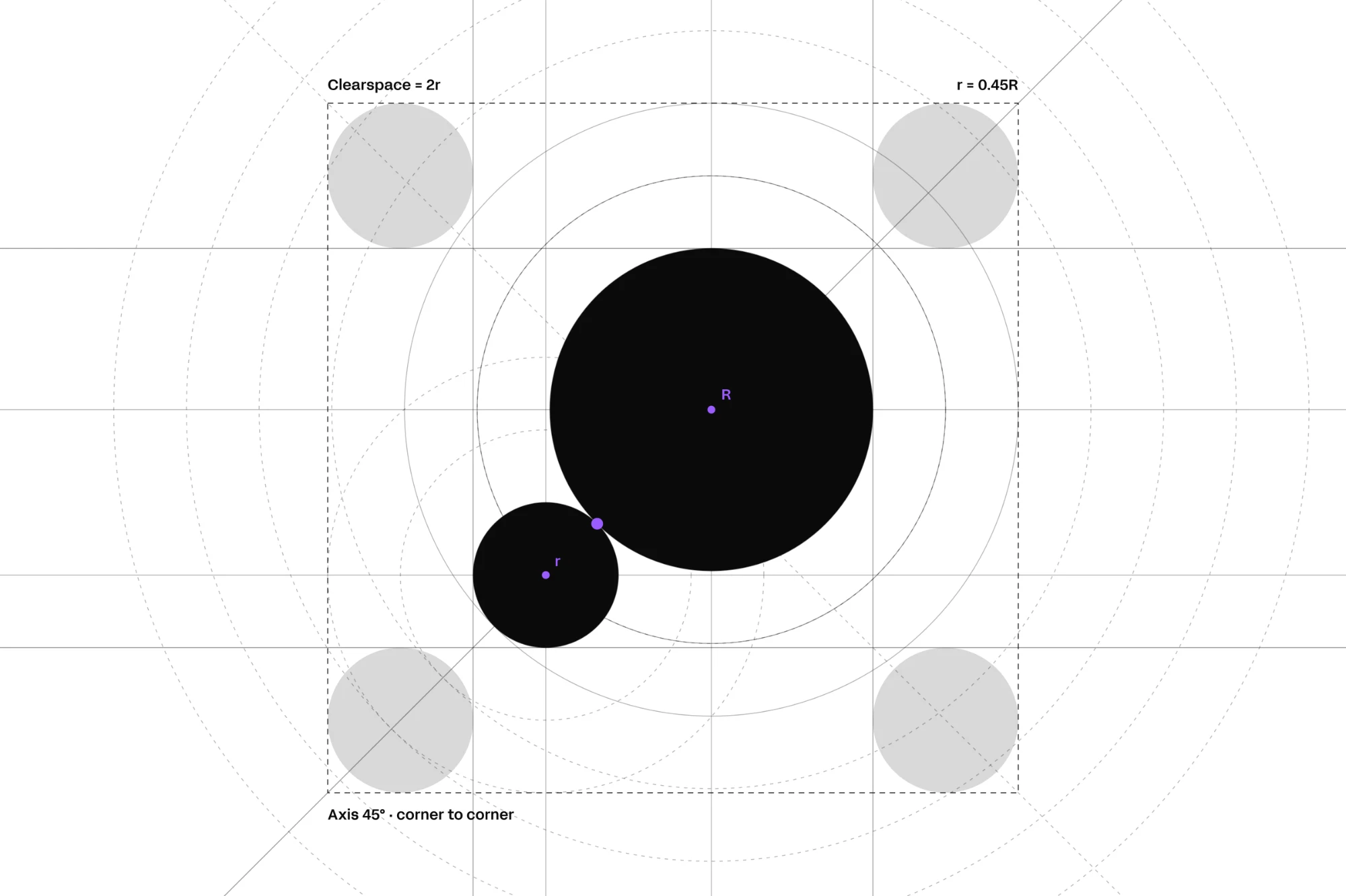
The whole identity grows from one simple relationship: a big circle and a small one, touching. The big circle is the employer and the reach. The small circle is the creator who passes the role on. Two shapes, one weight, and nothing that gets lost at small sizes.
The mark is drawn to exact geometry. The small circle is 0.45 the size of the large one, and the two meet at a single tangent point on a perfect 45° axis. That axis runs corner to corner through a square clearspace, so the symbol sits in a perfect square wherever it appears, from an app icon to a t-shirt.
(Wordmark and lockup)
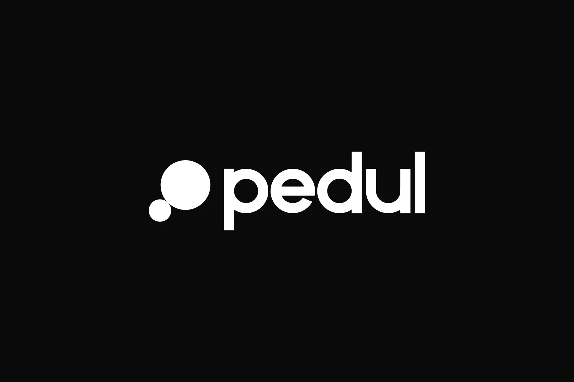
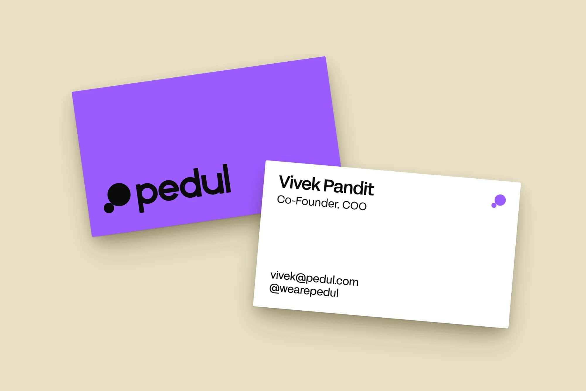
The custom lowercase wordmark is built on the same circles as the mark: round bowls, flat terminals and tight spacing, so the five letters read as one object, a crowd rather than a queue. It pairs with the symbol in a single horizontal lockup, with fixed proportions and clearspace measured by the small circle.
(Color)
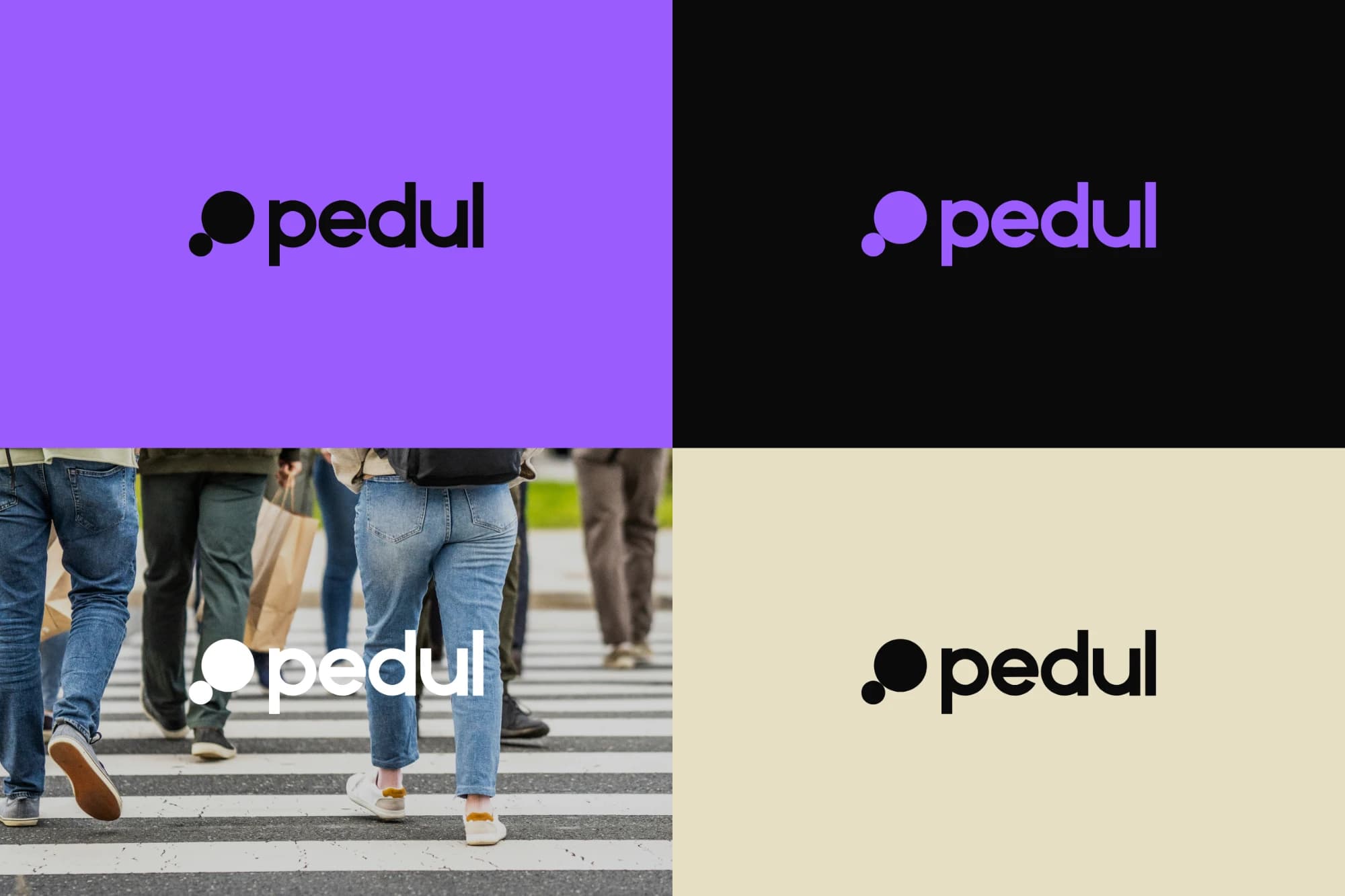
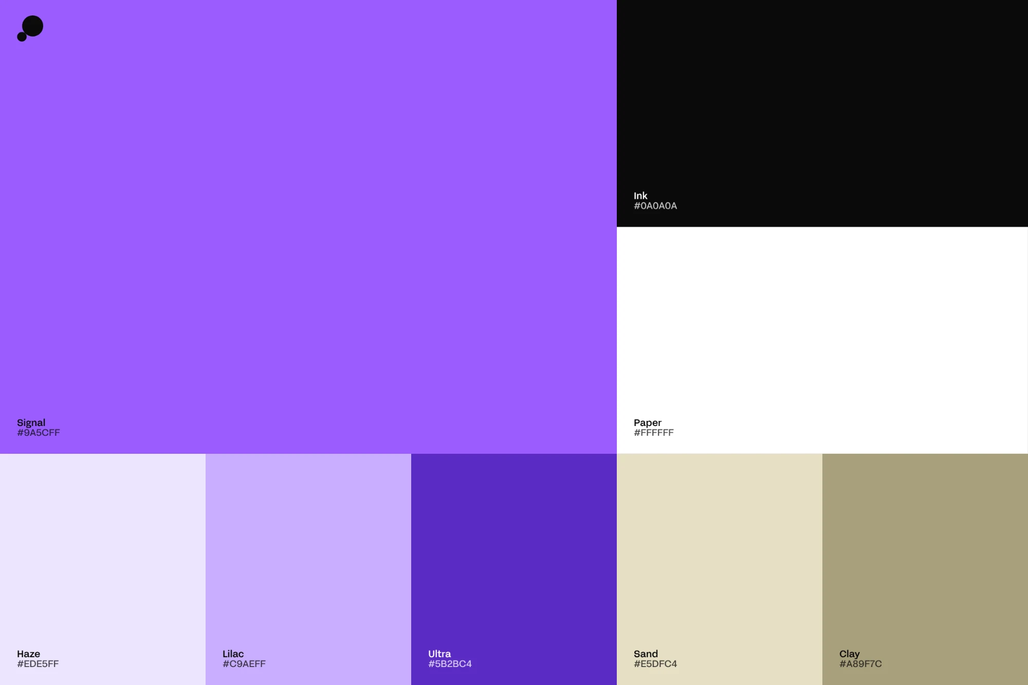
Signal violet is the hero. It isn’t an accent; it’s the ground, covering whole surfaces, screens and posts. We tuned it so black type passes contrast at body sizes, which lets violet and black do most of the work.
- Core: Signal (#9A5CFF), Ink (#0A0A0A) and Paper (#FFFFFF)
- Support: Haze (#EDE5FF), Lilac (#C9AEFF), Ultra (#5B2BC4), Sand (#E5DFC4) and Clay (#A89F7C)
- Secondary families: Air, Signal, Glass and Ground cover details, diagrams and UI.
- Fog: a frosted glass surface and the only component material. It lives on photography or violet, never on white.
(Typography)
One variable family, FFF Acid Grotesk, carries everything from 400px headlines to 13px captions. It’s clean and a little techy, but playful, with distinctive descenders.
SF Pro is kept for anything shown inside someone else’s interface, such as Instagram chrome and comment threads, so pedul content reads as native rather than as an ad.
(Imagery)
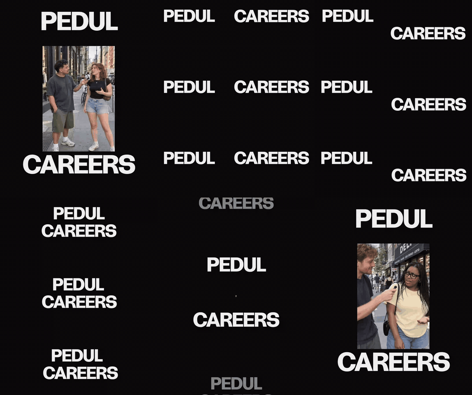
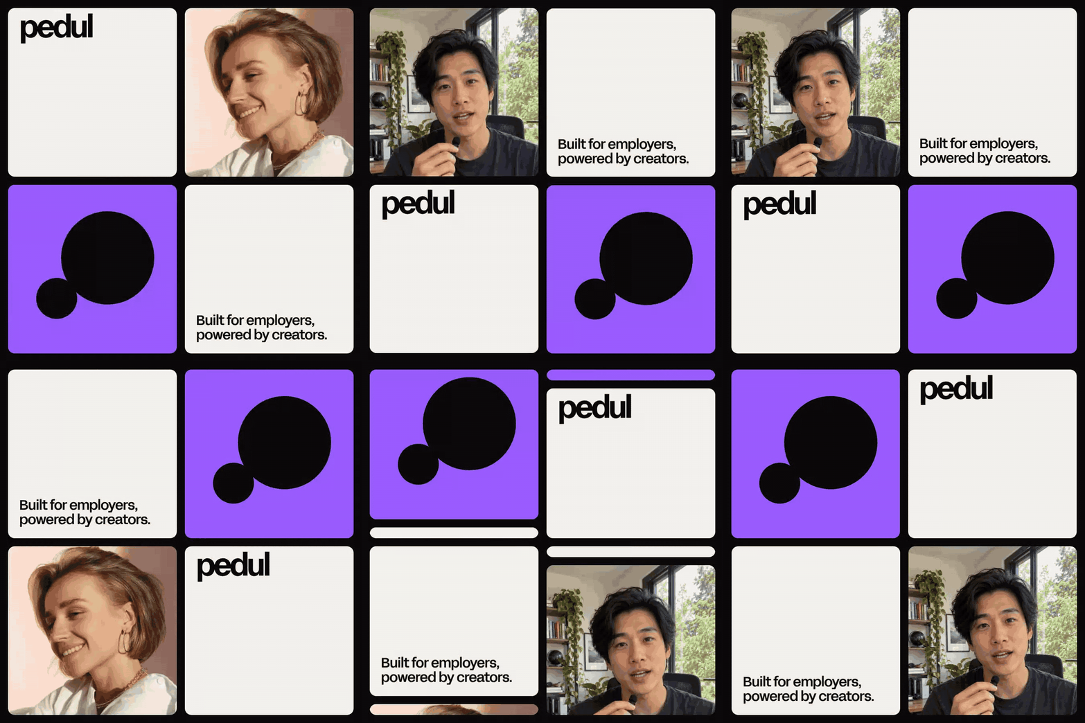
The photography is human first: creators talking to camera, real conversations on the street, and the workplaces where the roles actually exist. It’s shot candid, in daylight, with a phone often in frame as a prop rather than the subject.
We paired wide crowd shots with intimate close-ups, and the mark doubles as a container: a person inside the big circle, the one who passes it on in the small.
(Motion)
Motion is central to the brand, because the product is about movement. The two circles grow, hop, breathe and hand off, acting out a role traveling from one person to the next.
One asymmetric easing curve runs the whole system: fast to leave, slow to land. Circles scale and travel, but they never squash or rotate. The system extends into kinetic type posters, word walls and a data wall where rows of stats, posts and testimonials snap past like traffic.

(Voice)
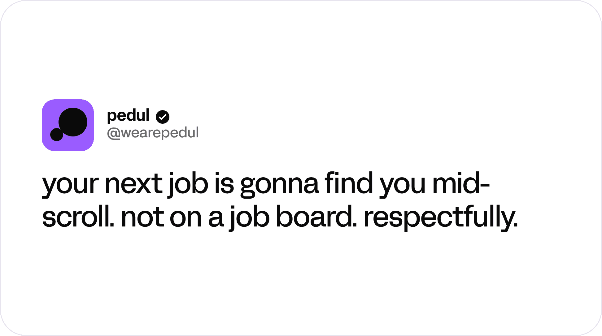
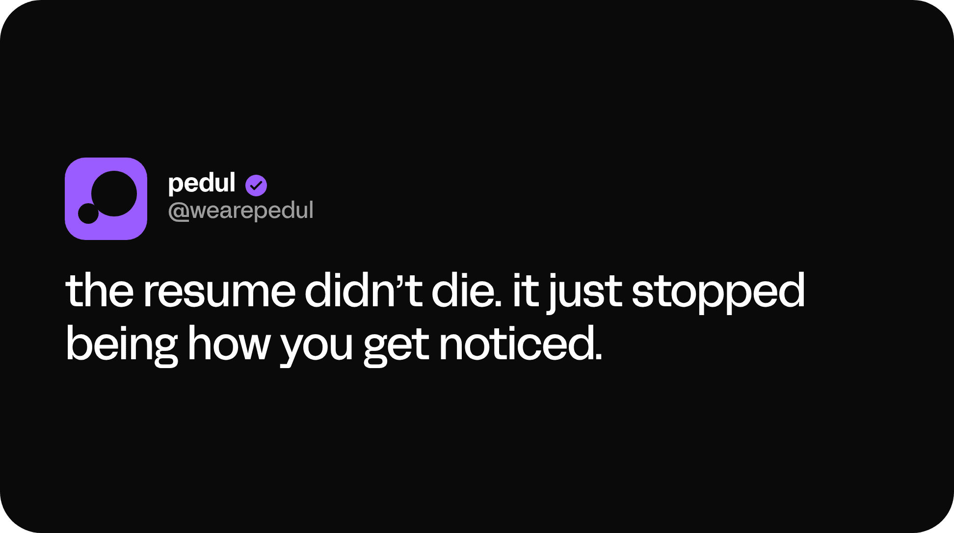
The tone is plain, confident and a little dry. Lines like “You can’t hire who you can’t reach” and “Social proof travels faster than any AI tool can” anchor the brand.
On social it loosens up, reading like a text from a smart friend: lowercase, no hashtags, one idea per post.
(What we did)
- Logo system and construction
- Color and type systems
- Glass UI components
- Social templates: Instagram posts, comment threads and brand voice posts
- Motion library with animated GIFs
- Messaging platform