Work / Dova · 2026
DovaA New Partner for Couples’ Therapy.
- Client
- Dova
- Role
- Brand identity partner
- Services
- Naming, brand identity, brand concept, motion, clinical interface studies
(Overview)
Relationships unfold in the moments between therapy sessions. Dova is a platform for couples therapists and the couples they support, built to carry therapy into everyday life. Therapists use Dova for session insights and practice support, while couples engage directly through Dova Chat, a private, HIPAA-compliant thread that guides them through conflict and reflection between appointments. Guided by Esther Perel’s approach to curiosity, connection, and the complexity of relationships, Dova brings insights from life at home back into the therapy room, creating a continuous learning loop with the therapist at the center of care.
Relationships are emotionally complex, and the brand had to feel human, intimate and credible without clinical coldness, wellness clichés or the familiar look of AI. The platform is built around Esther Perel’s defining work on relational intelligence, and the brand had to carry that depth while standing on its own as a product clinicians would trust. It also had to stay recognizable at the smallest sizes: a chat avatar, a contact card, a browser tab.
Continuing the naming and identity work from earlier sprints, we took one idea, the parenthesis, and carried it across every surface: a mark made of two arcs, a serif reserved for what is held, words with room in them, posters, a billboard, a brand film and a clinician’s dashboard. It is our answer to one question: with clinicians as the first audience, what could the brand be?
(At a glance)
- Client: Dova
- Foundation: Esther Perel’s work on relational intelligence
- Year: 2026
- Our role: Naming, brand identity, exploratory brand concept
- Status: A “what the brand could be” concept, continuing the naming and identity sprints
- Audience: Couples therapists, and the couples they see between sessions
(The shift)
The work began under a different name. Codel was a positioning and naming sprint around accessible relational health, with two territories to explore: Response, for navigating difficult conversations, and Clarity, for understanding and saying what you mean. Codel became Dova, and an identity followed.
By the summer the market entry had changed, but the service hadn’t. Instead of going straight to couples, Dova would reach them through their therapist: a continuous loop in which a couple talks in their iMessage thread between sessions, and the clinician sees what matters before the next one. The platform is built around Esther Perel’s defining work on relational intelligence, and the brand now had to carry that warmth and emotional depth alongside the rigor a practitioner expects.
This concept is our answer to one question: with clinicians as the first audience, what could the brand be?
(Why between sessions)
The case for Dova sits between two bodies of evidence. Couples therapy works, and people are already bringing AI into their relationships, often without telling anyone.
- 60–80% of distressed couples benefit from behavioral and emotion-focused couples therapy, in a 2020 research review.
- 2,092 couples across 58 studies showed a large improvement in relationship satisfaction in a 2020 meta-analysis.
- Nearly 4× the rate of clinically significant change when structured client feedback was built into couples therapy, in a 2009 randomized trial of 410 people. It tested progress feedback rather than AI, but it is the closest fit to Dova’s loop.
- 67% of Gen Z singles reported using AI for dating in the 2026 Singles in America study.
- 19% of Americans aged 12 to 21 had used an AI chatbot for mental-health advice, and 63% of them had told no one, in a 2026 RAND survey.
- 51% average reduction in depression symptoms at eight weeks among users of Therabot, a purpose-built therapy chatbot, in a 2025 randomized trial of 210 adults. That trial measured individual symptoms, not couples.
None of these studies looked at Dova itself. Together they say why a loop between couples and their clinician is worth building, and why the brand should feel like care rather than software. We set the four headline numbers in motion on the brand’s darkest ground.
(The idea: the parenthesis)
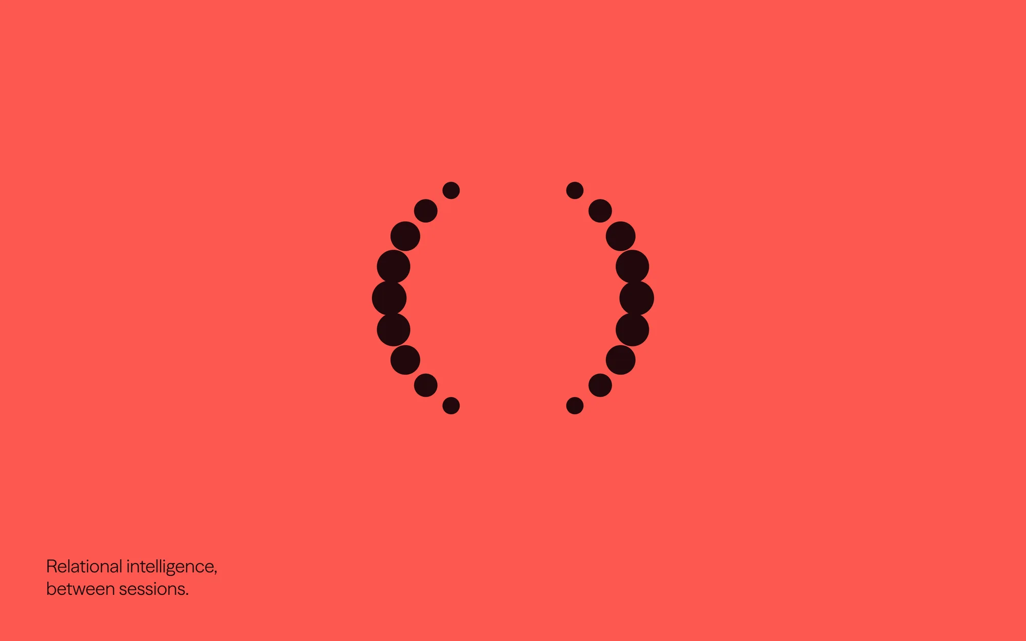
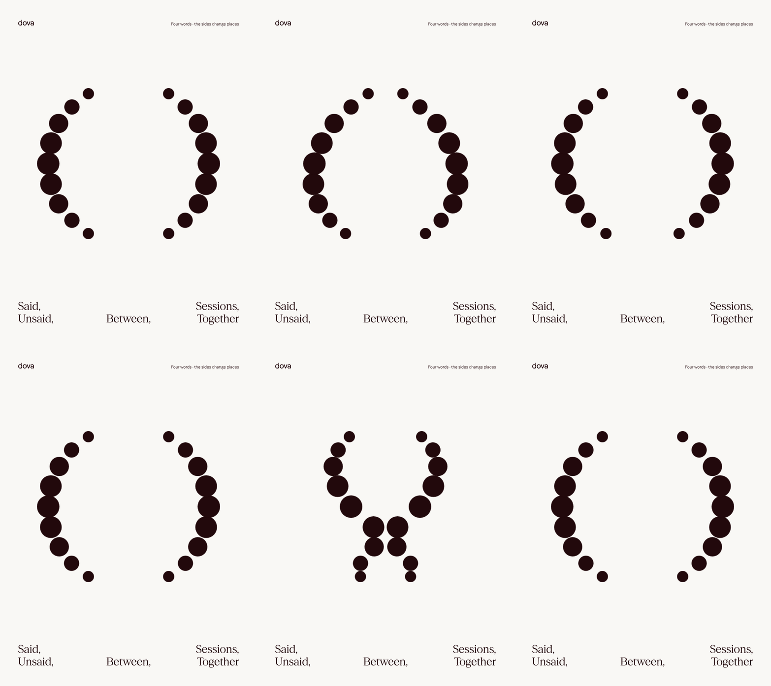
Every relationship has two voices: what is said, and what is held. The parenthesis is the typographic sign for the second, and we made it the whole identity.
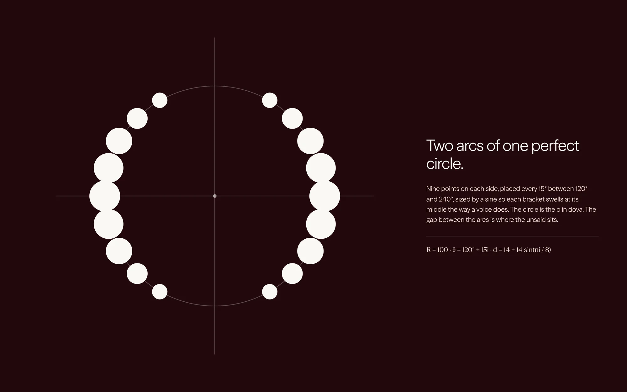
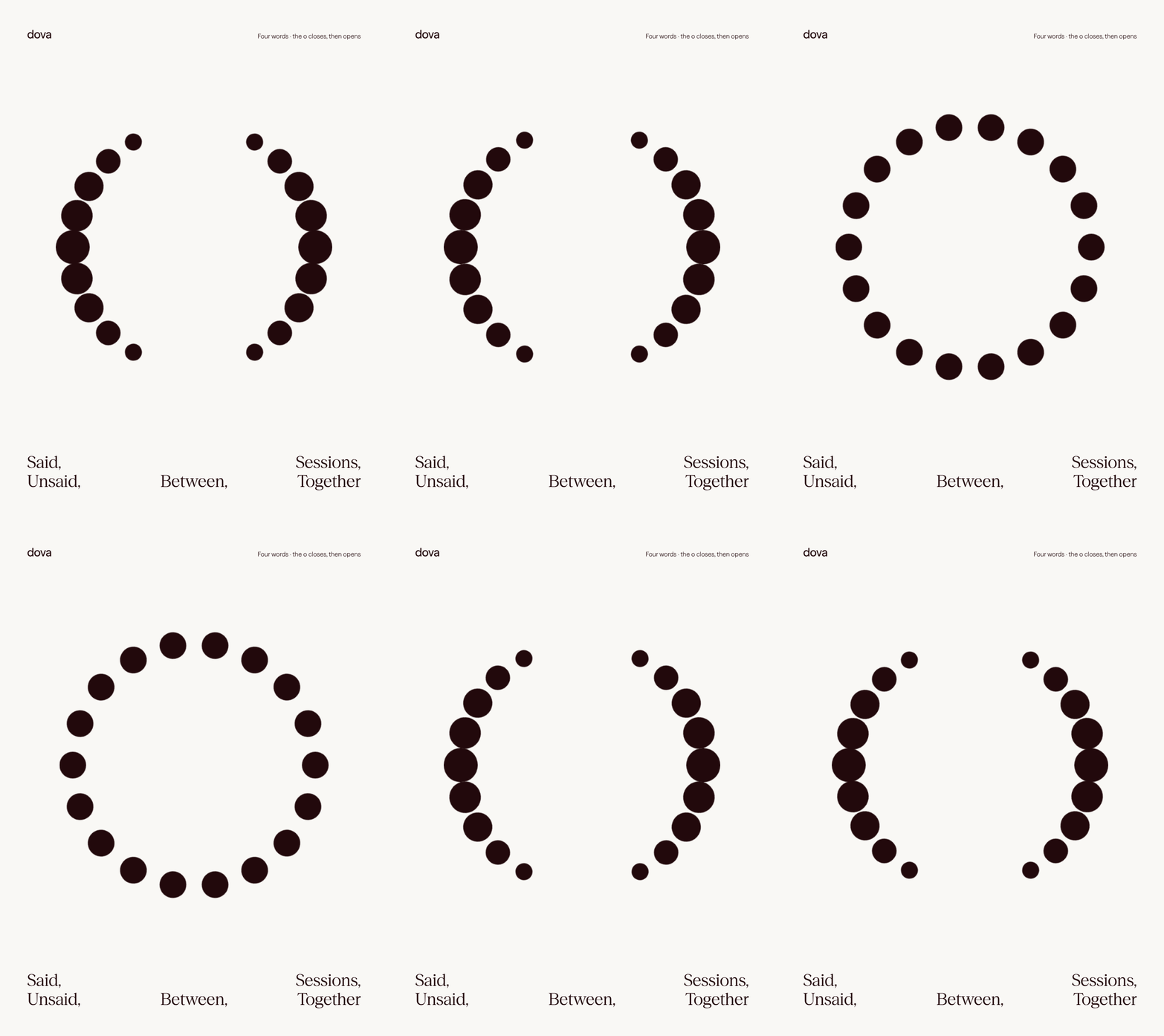
The mark is two arcs of one perfect circle. Nine points on each side, placed every 15° between 120° and 240°, sized by a sine so each bracket swells at its middle the way a voice does. The circle is the o in dova. The gap between the arcs is where the unsaid sits.
(Built for small sizes)
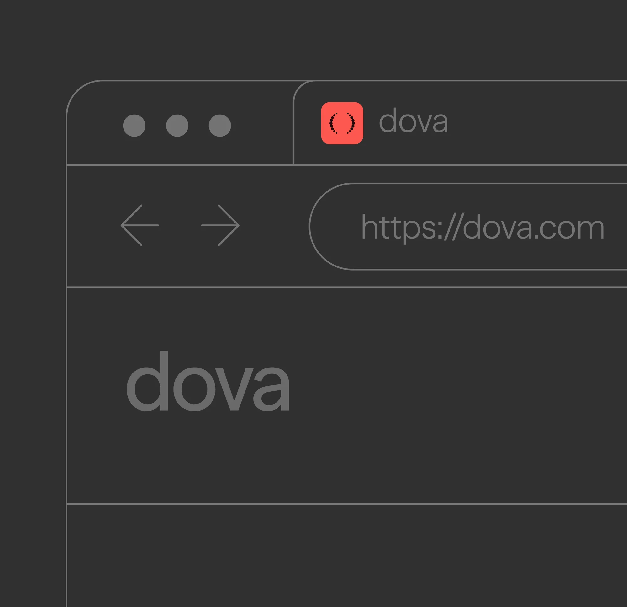
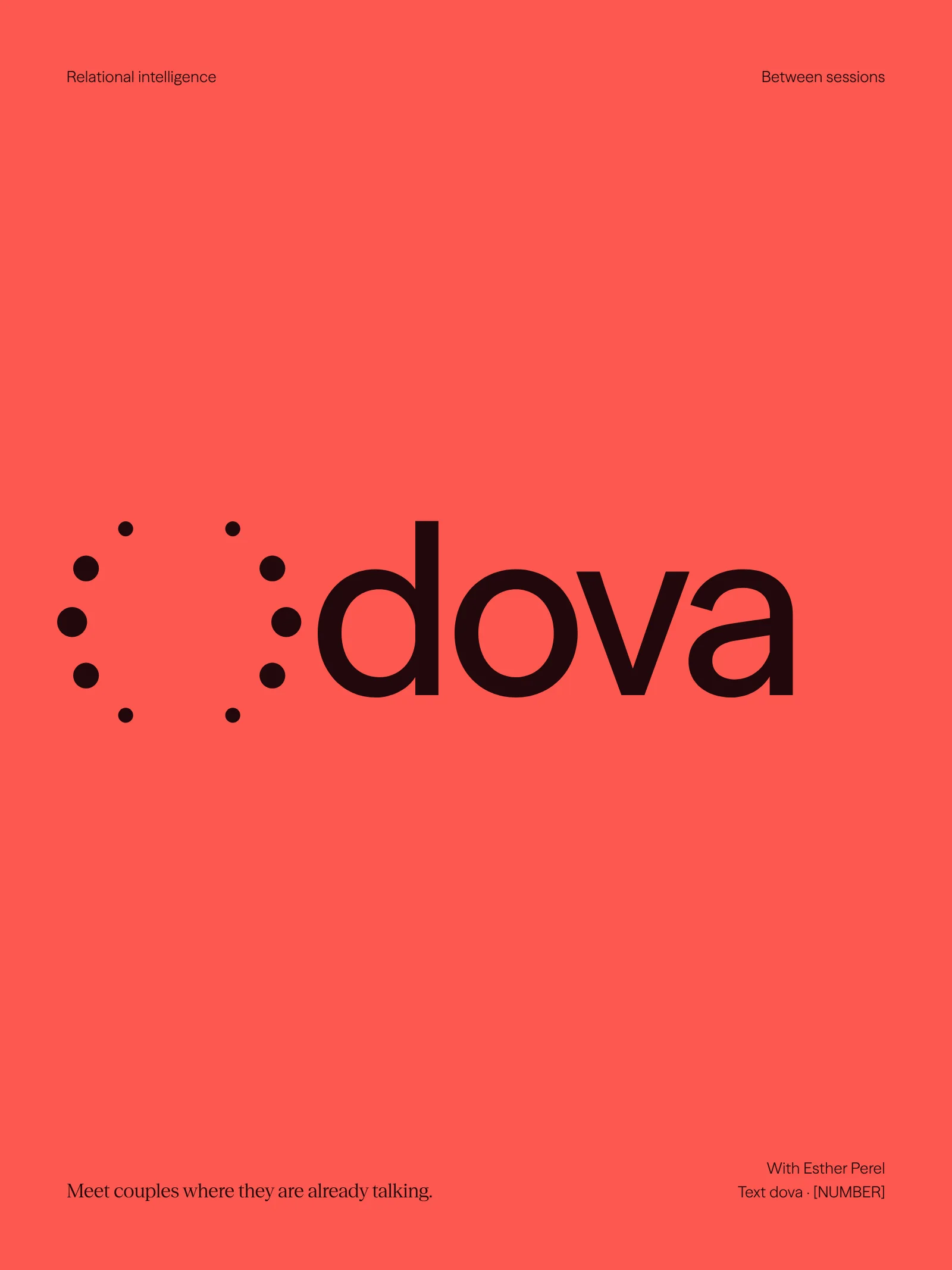
Dova lives in text. The mark had to hold as an avatar in a thread, an icon in a dock and a favicon in a browser tab, so it is drawn from dots on a circle rather than strokes, with no hairlines to lose. In the wordmark the two arcs stand in for the o, and the lockup reads at a glance even at the size of a browser tab.

(Said (held))
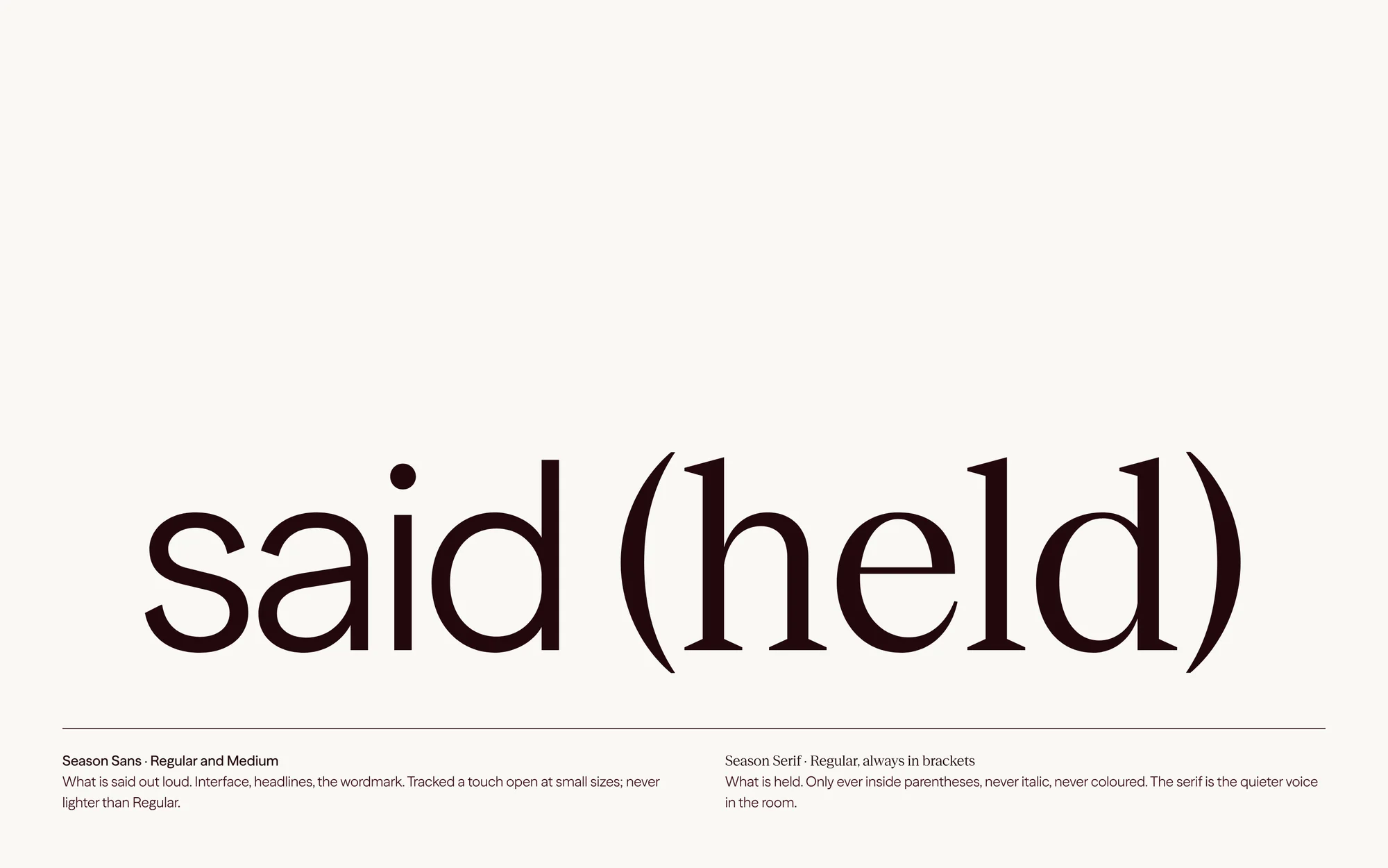
Two voices need two faces. Season Sans, in Regular and Medium, is what is said out loud: interface, headlines and the wordmark, tracked a touch open at small sizes and never lighter than Regular. Season Serif is what is held. It appears only inside parentheses, never italic and never colored. The serif is the quieter voice in the room.
(Color)
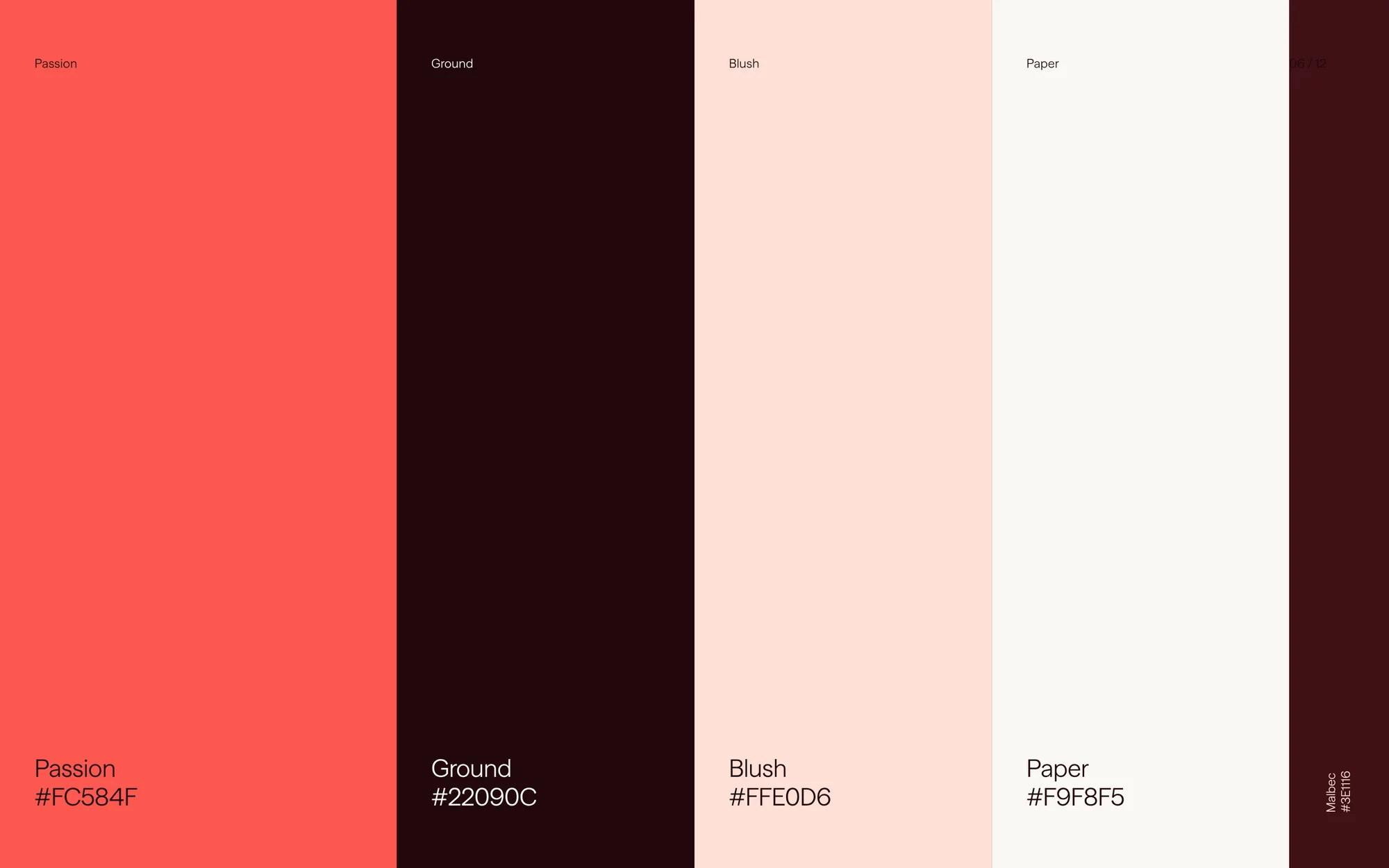
Four colors, one ink per surface. Passion (#FC584F) is the brand’s heat and the ground for posters and icons. Ground (#22090C) is the near-black that holds the data and the clinic’s navigation. Blush (#FFE0D6) and Paper (#F9F8F5) are the quiet surfaces where most of the reading happens. Malbec (#3E1116), the dark ground of the identity work, sits alongside as a bridge between the two.
(Words with room in them)
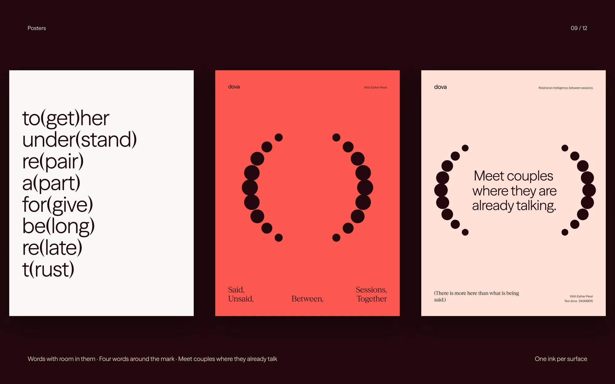
The brand’s voice puts the held thing inside the said thing. to(get)her. under(stand). re(pair). a(part). for(give). be(long). re(late). t(rust). Each is one word with a second inside it, and the parenthesis does the work the mark does: it holds what isn’t said out loud.
Posters follow the same rule. One ink per surface, four words around the mark, and a line that says what Dova is for: meet couples where they are already talking.
(Motion)
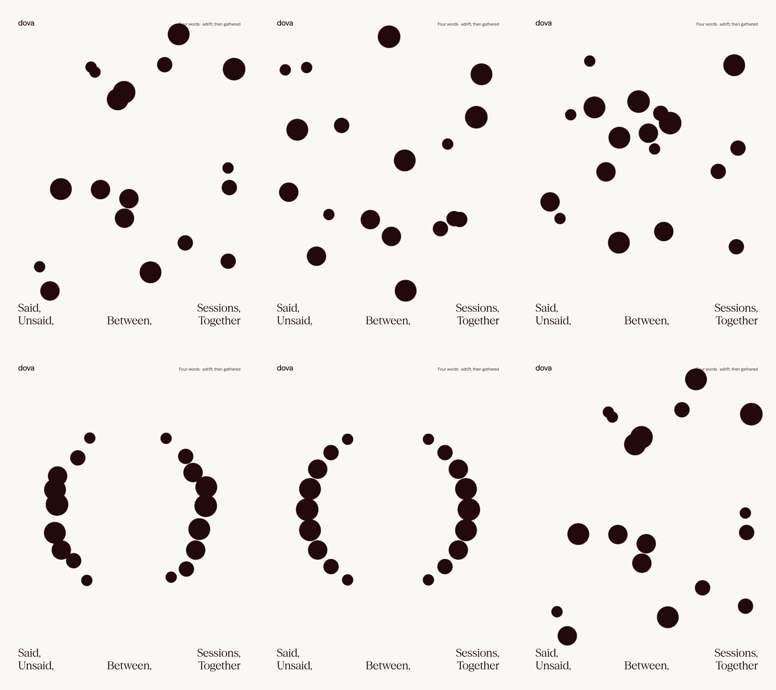
Motion is quiet and tidal. In the brand film the mark gathers from scattered points, the system fans out as a set of cards, and the points settle back into place. In the animated posters the four words drift and are gathered, the o closes and opens, and the two sides change places. Rows of words roll past with glimpses of couples in the gaps between them. Nothing bounces. Everything breathes.
(Out in the world)
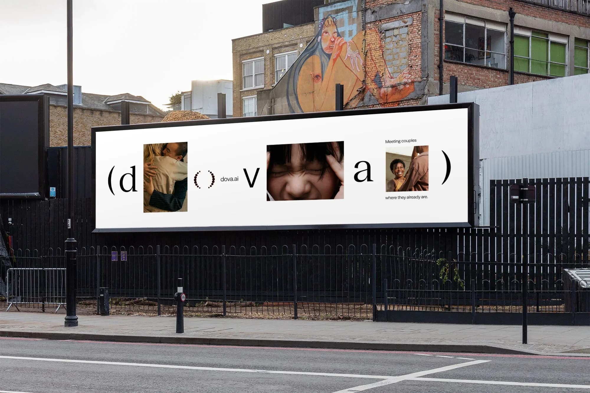
A billboard tests the idea at street scale. The letters of dova are interleaved with photographs of couples, the mark stands in for the o, and one line sits beside it: meeting couples where they already are. If the parenthesis can hold a street, it can hold a chat thread.
(The clinic)
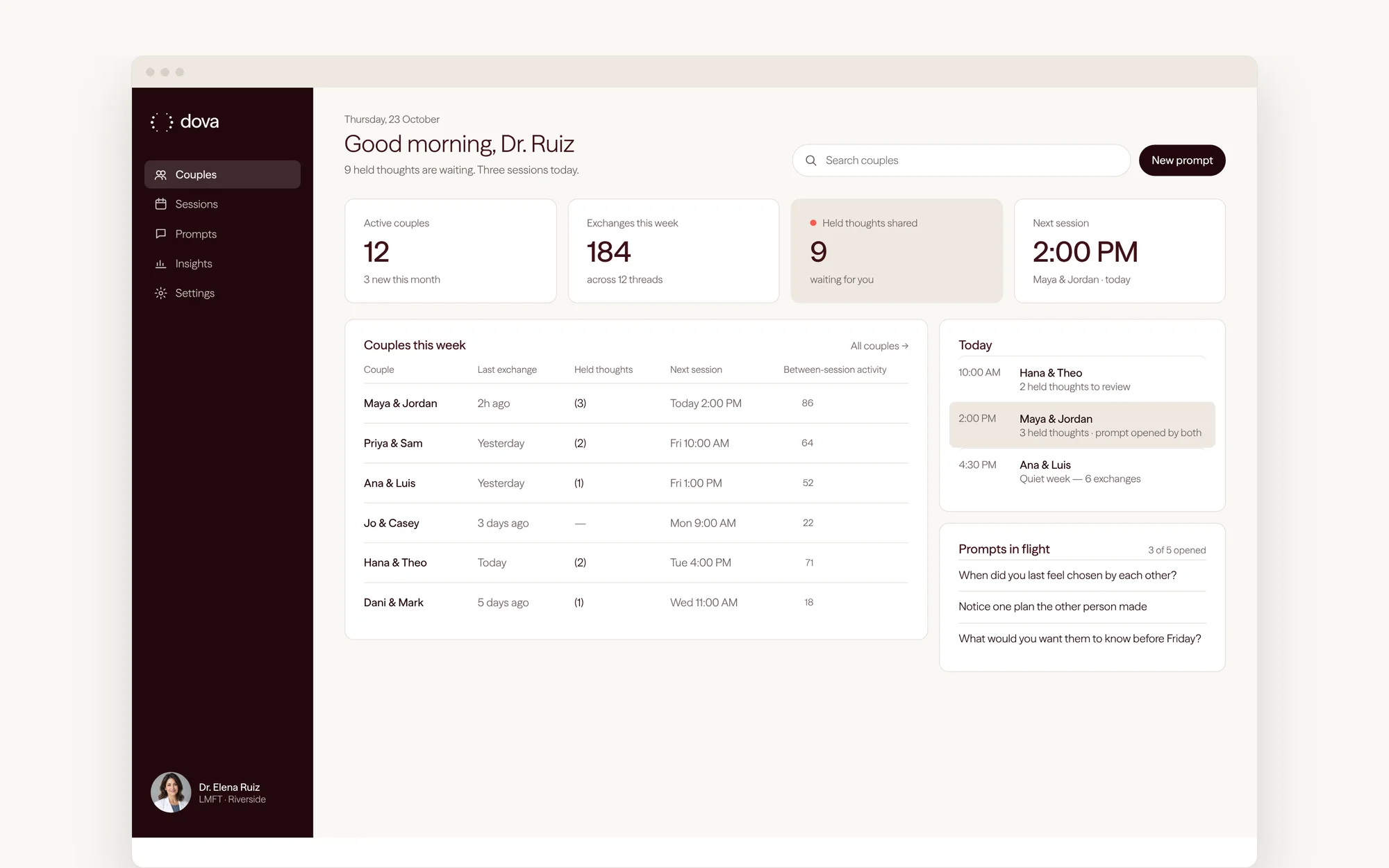
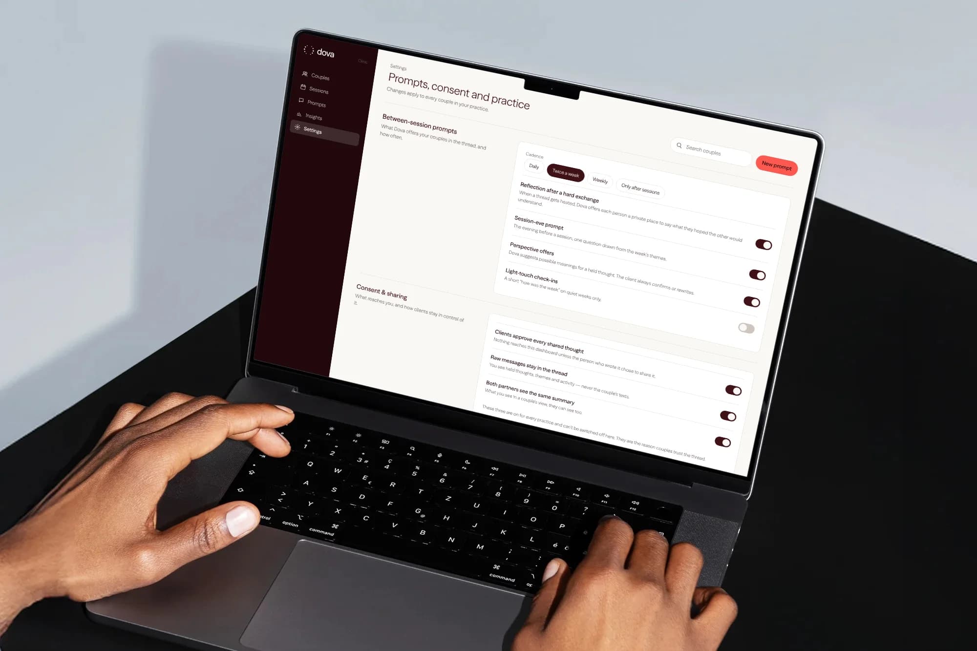
A clinician-first product needs an interface a practitioner trusts at eight in the morning. We sketched the dashboard a couples therapist opens before a day of sessions: the couples they will see, the held thoughts waiting for review, prompts in flight and what the week looked like between appointments. Ground holds the navigation. Paper holds the reading.
The settings study makes the brand’s ethics legible. Clients approve every shared thought. Raw messages stay in the thread, so the therapist sees held thoughts, themes and activity, never the couple’s texts. Both partners see the same summary. These three are on for every practice and can’t be switched off. They are the reason couples trust the thread.

(What we did)
- Naming, from Codel to Dova
- Mark construction, wordmark and lockups
- Type and color system
- Words with room in them: voice and poster system
- Brand film, animated posters and rolling word rows
- Clinician dashboard and settings studies
- App icon, favicon and billboard applications